Michael Hanson Product Designer
For ten years at Hudl, I led teams crafting experiences for coaches, athletes, and teams across multiple sports and platforms.
You can see my résumé here, or learn a little more about me.
Let's connect: grab a time or email me
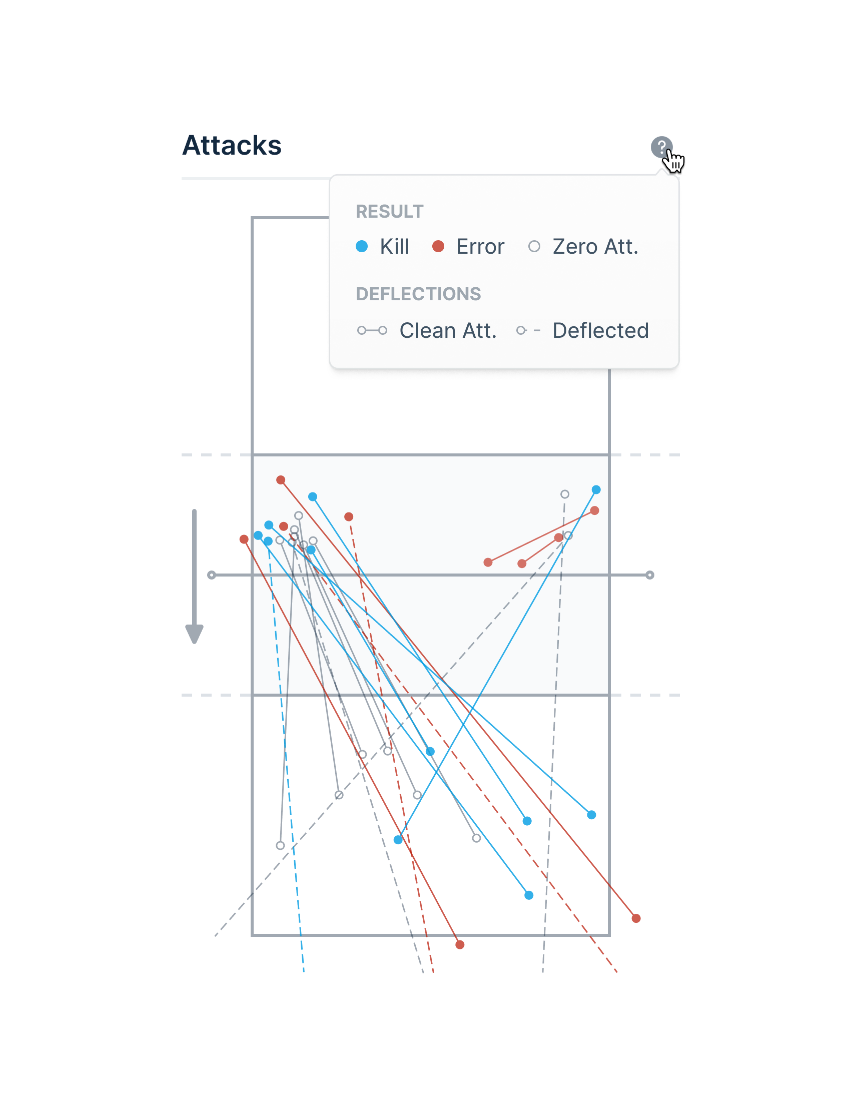
Volleyball Attack Tendencies →
2018–2019
User research Problem definition Rapid prototyping Statistical testing Visualization design Ergonomic analysis Usability testing
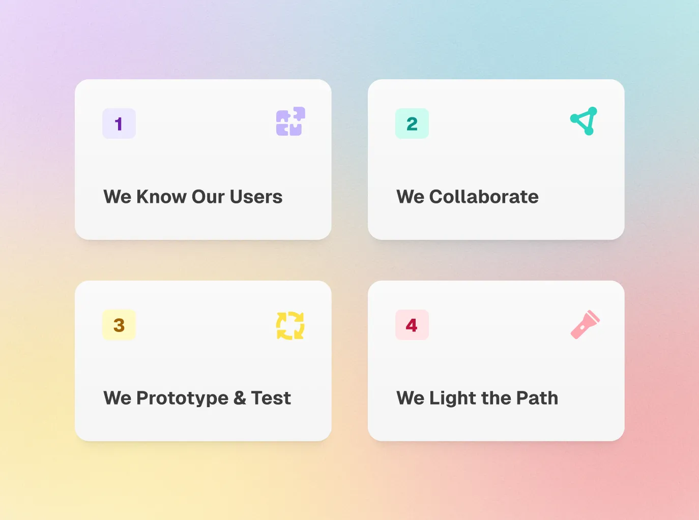
Hudl's Design Team Values →
2023
User research Copywriting Prototyping Usability testing Advocacy
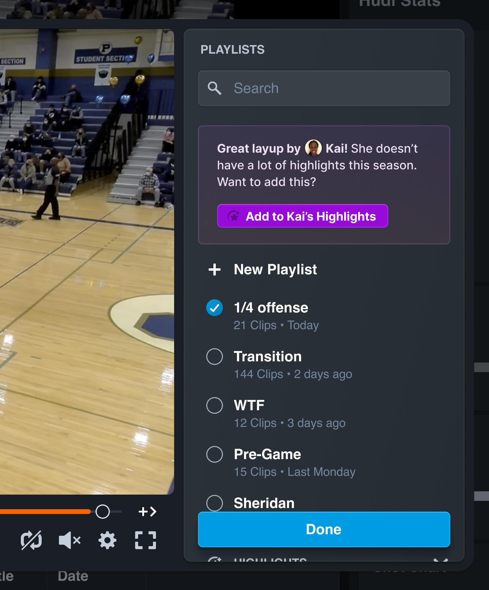
Clipping and Curation →
2024
User research Problem definition Product direction Interface design Usability testing
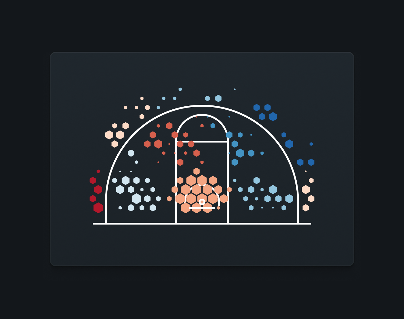
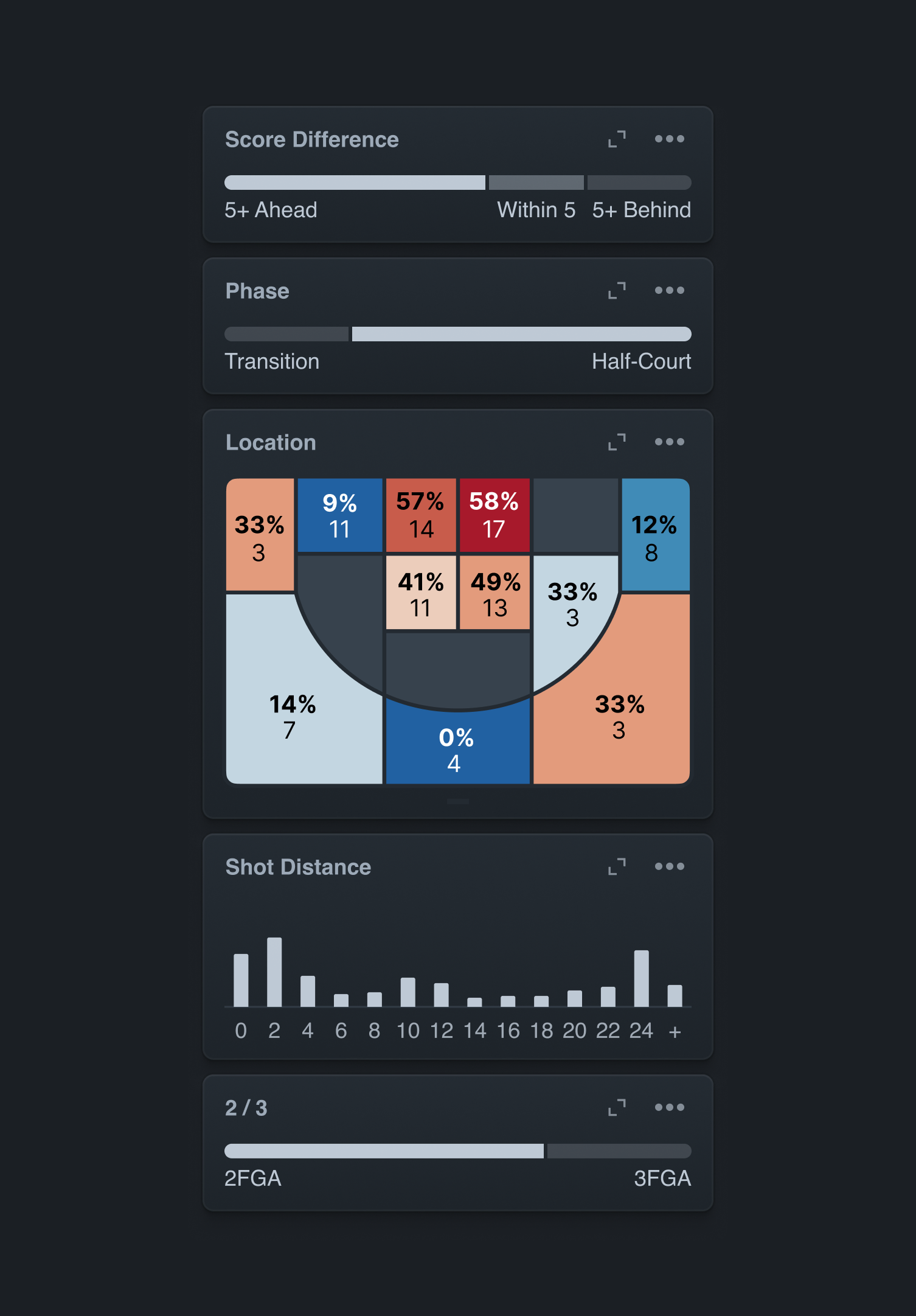
Advanced Basketball Shot Chart →
2023
User research Domain research Rapid prototyping Visual design System design Semantic analysis Usability testing
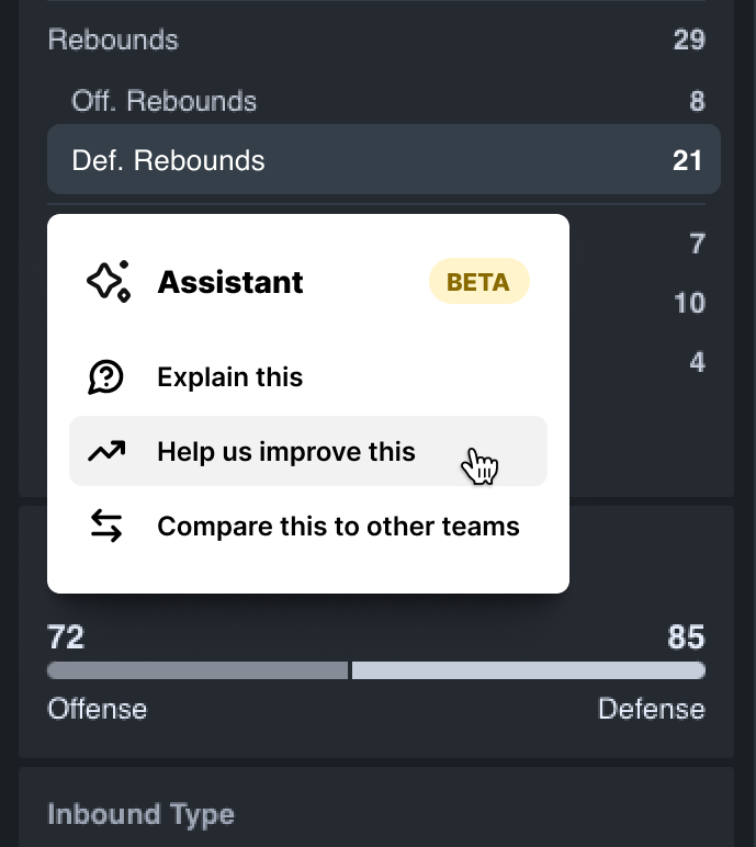
Large Language Model Integration →
2024 • Concept
Research Interface design
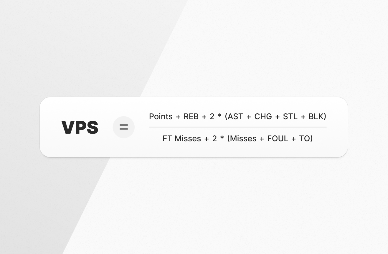
Advanced Reports and Statistics →
2014–2016
User research Problem definition Rapid prototyping Visualization design System design Programming Usability testing
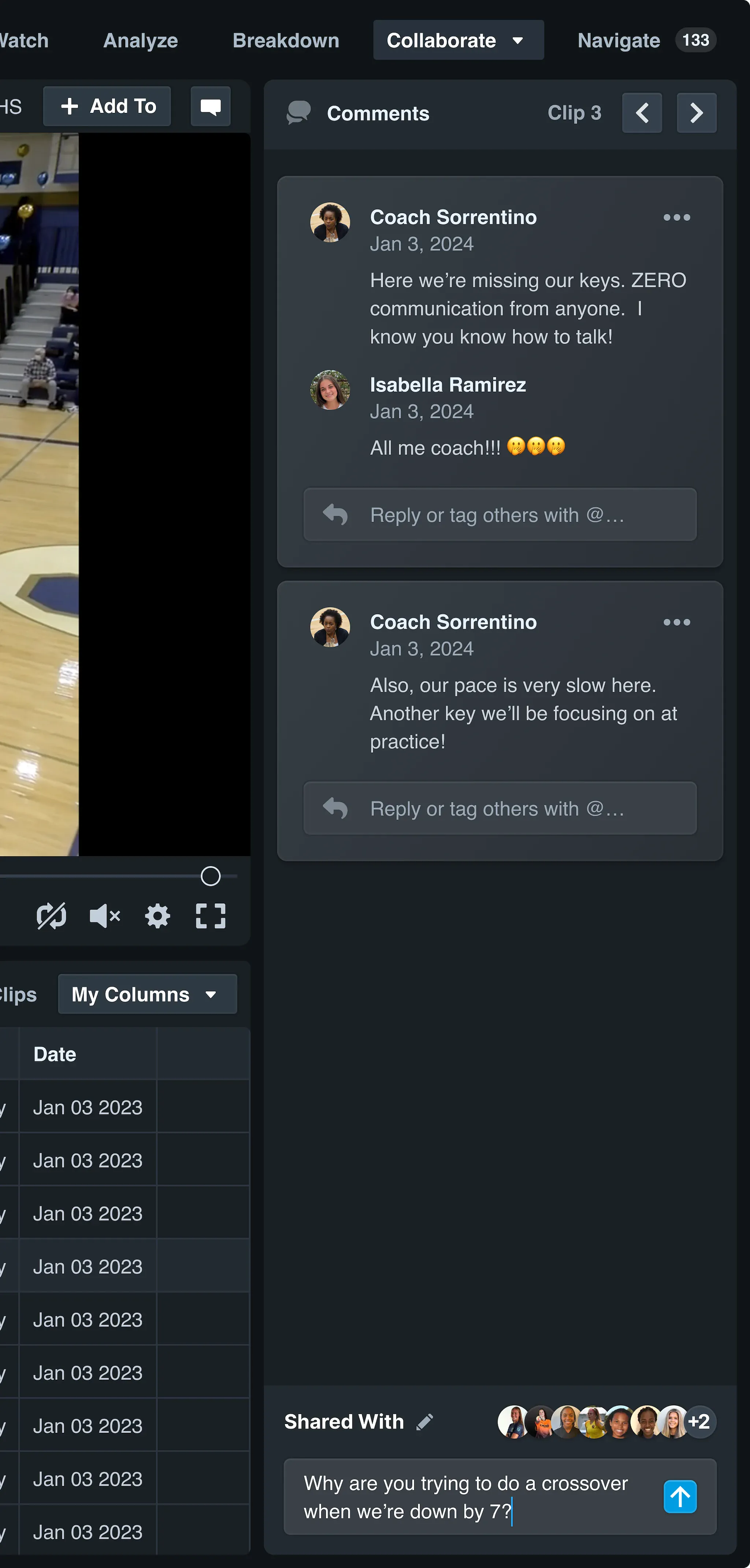
Comments and Conversations
2024
User research Problem definition Product direction Interface design Usability testing
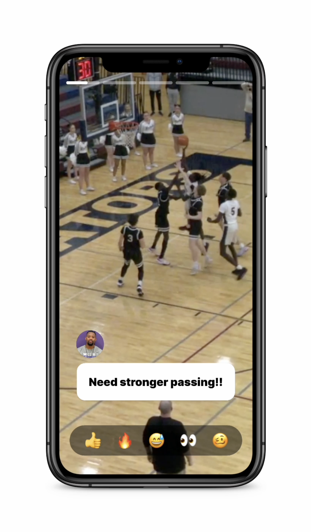
New Athlete Video Experience
2024 • Concept
Rapid prototyping Interface design Animation design Programming
The New Hudl for Basketball
2021–2024
User research Product direction Interface design System design Visualization design Usability testing
Five-Year Strategy Illustrations
2020
Art direction Visual design
I have also created several personal projects. Here are a selection of those.
A Dashboard for Beeminder →
2023
Visual design Programming
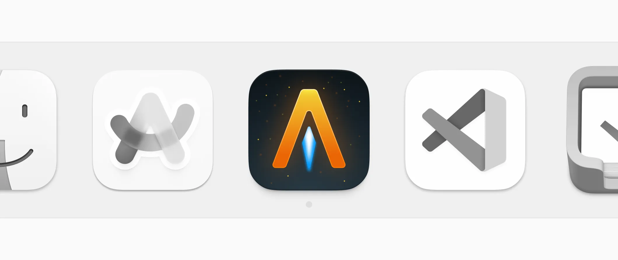
Alacritty icon for macOS
2024
Visual design
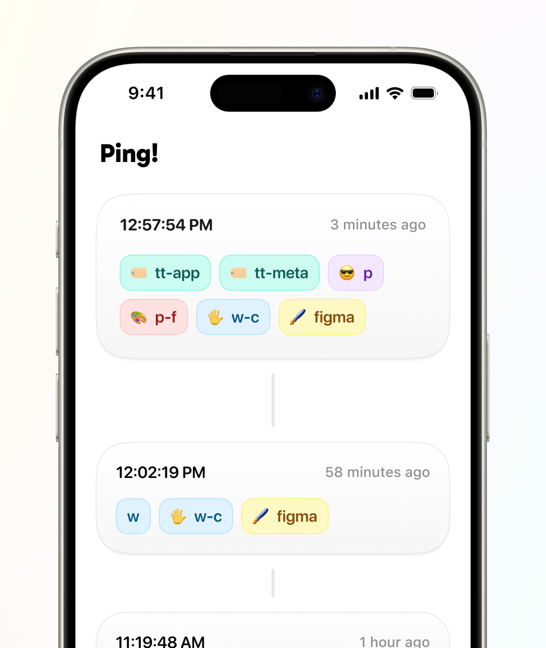
TagTime iOS App
2023
Visual design Interaction design Programming
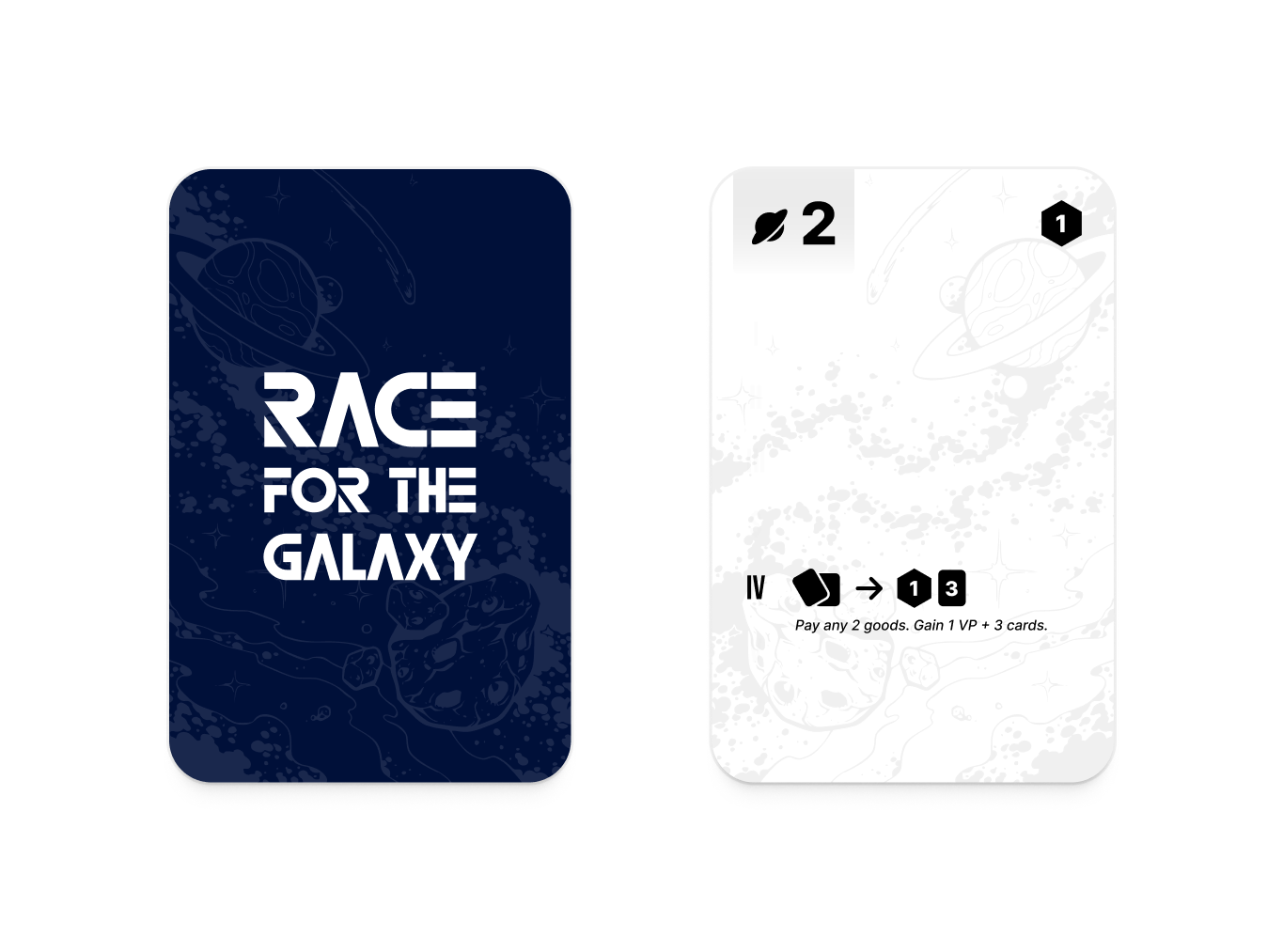
Race for the Galaxy Card Game Redesign
2021 • Concept
Art direction Visual design
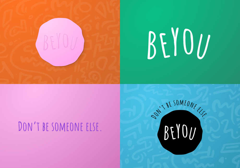
Beyou Branding Exploration
2021 • Concept
Art direction Visual design
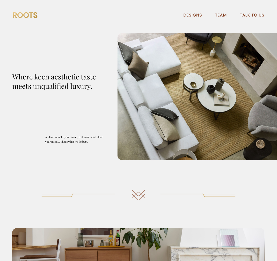
Roots Branding Exploration
2021 • Concept
Art direction Visual design