Advanced Basketball Shot Chart
2023
Context • In basketball, shooting is everything. Basketball players are expected to know where they
shoot well, to know where they don't, to know how the player they're defending likes to take
shots, and how to push them into less efficient locations on the court.
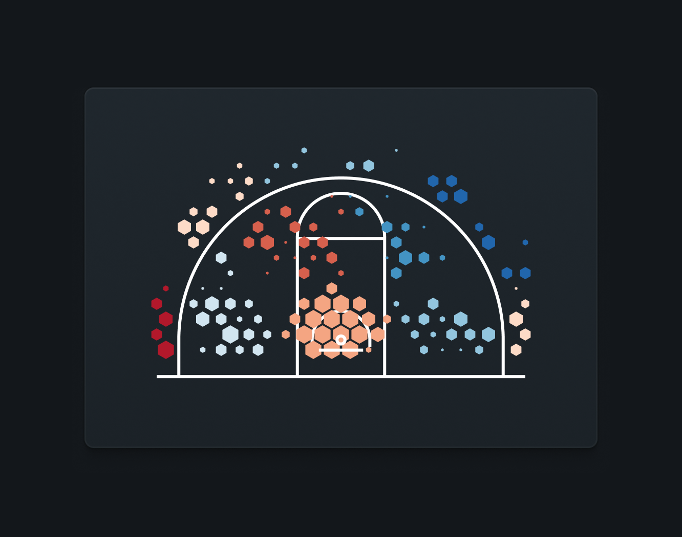
The Problem • I designed Hudl's first shot chart, which has proved itself invaluable for basketball teams.
However, since it was released (in 2014), the state of the art of shot visualizations has
changed. Our original shot chart was univariate, meaning we would only visualize one variable
at a time. Yet there have always been two variables that are key to shooting: how
often
one shoots from a location and how well one shoots from that location. In the years since
that first shot chart, Hudl had also advanced the ways we generate basketball data, meaning we
could generate shot charts that were more accurate in the same amount of time.
The Solution • Our new shot chart would be familiar to our existing teams while driving new insights for the
next generation of Hudl teams. It would use advancements Goldsberry and others had pushed
forward. It would continue to be interactive, intuitive, and delightfully dynamic.
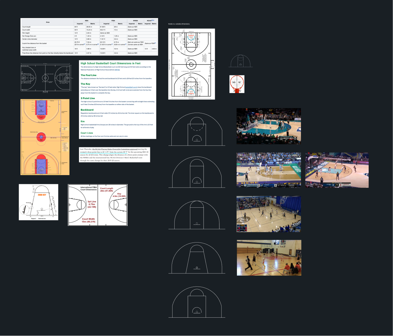
A challenge with high-accuracy basketball shot charts is there is no one standard basketball
court. Court dimensions differ, depending on the level of play and the location. If our charts
were truly going to be accurate, we would have to use the correct chart for any given game. I
painstakingly laid out pixel-perfect diagrams of every basketball half-court for us to test
our charts against.
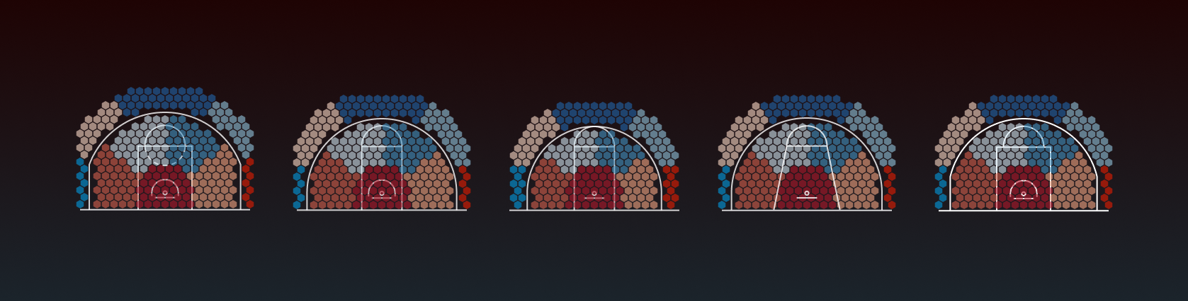
Finding the perfect layout across different courts.
We experimented with different hexagon sizes, different zone layouts, different colors, and
more, testing across different basketball layouts and getting feedback from users at all
levels of play.
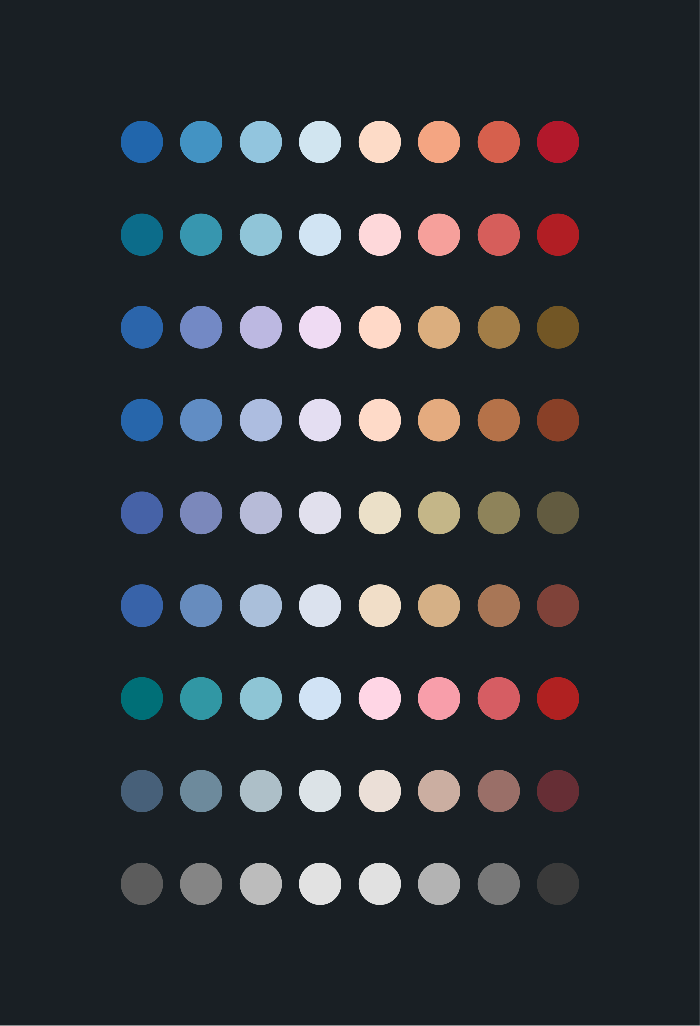
Testing our new colors for accessibility.
One particular challenge came from the fact that users would be able to view data from
different levels of play at the same time. Hundreds of games from all levels, perhaps. The
different courts would stress the accuracy of our diagrams. I did a semantic analysis of the
hexagons at widely varying levels to see how much of a problem it might be, and then to find
what, if anything, we needed to change to handle it.
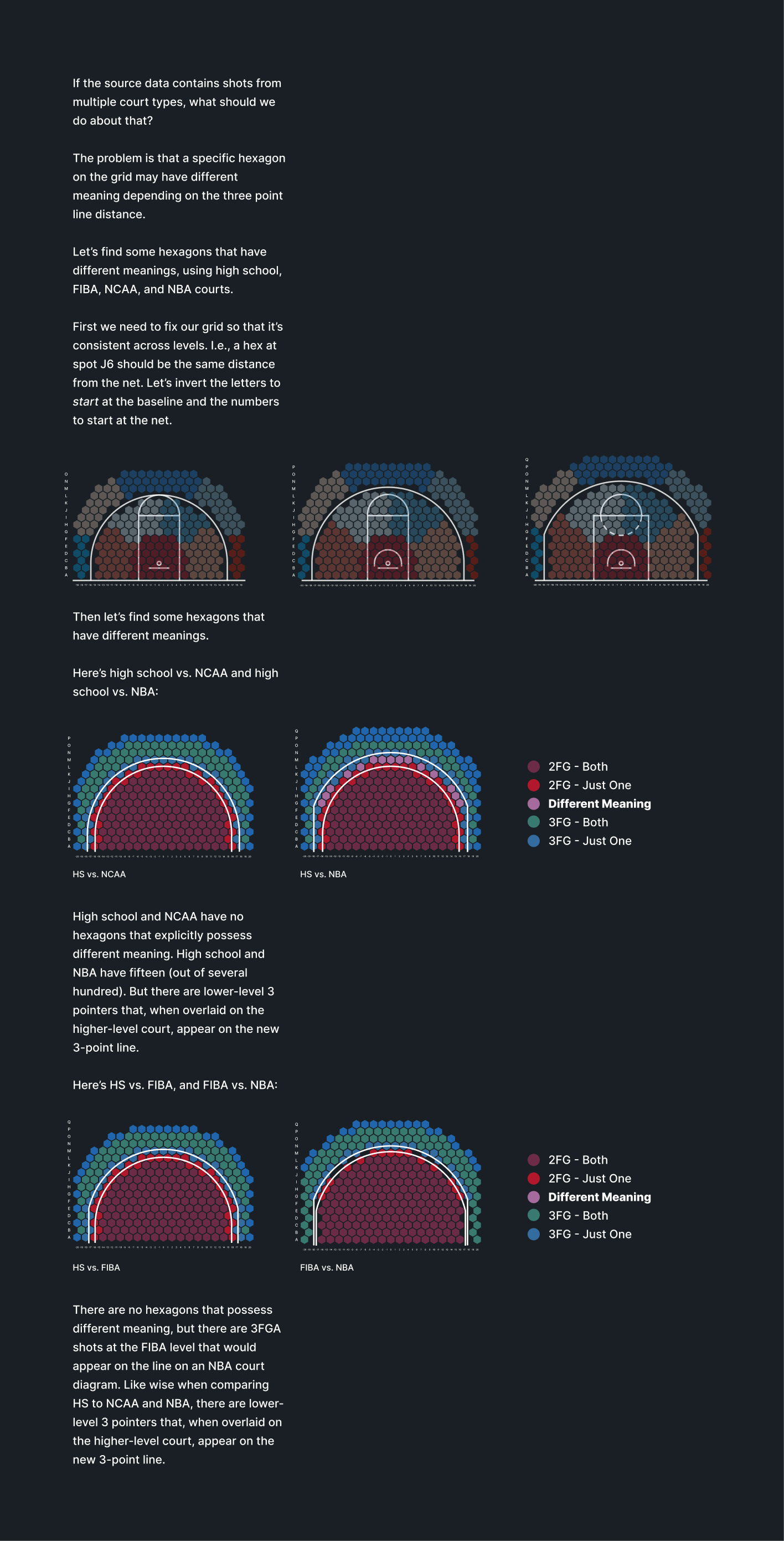
Analyzing hexagon meaning at different levels of play.